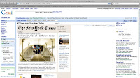
Well with this first attempt I really kind of got stuck on the really cut and dry look. I had a hard time getting away from the olde look of the New York Times logo. I chose really muted colors and just did a main article with related articles.

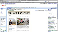
For my second attempt I tried to push and clean up my type. Stuck with the boring more practical ideas. Not pushing colors or layout. This one I think doesn't work because I made the related items almost the same size as the main article.

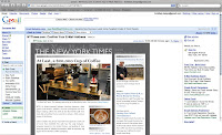
My third attempt made use of a slightly more design oriented layout. A dark grey background with a low opacity NYTimes logo, under a new sand serif logo, I felt it looked a little like a cityscape. I combined all links and media into one column right under the main image of the featured article.

I made a final attempt to young it up a bit. its still clean but it has a little more to it. I used the original logo as a back ground texture, and made an icon system. I used 3 icons to represent the things the subscriber would have checked off as interests when signing up. They are color coded, and each section would correspond to whatever subject it lies under.

No comments:
Post a Comment