

Monday, September 29, 2008
Thursday, September 25, 2008
researching the jewish voters.
1. Some shared values other than being prominently democrat, their religion, whether they be orthodox or reformed there are some aspects that remain the same. Being Jewish goes beyond being a religion and more into a culture. Food, interactions, the high holidays, all things that pull all the parts of the Jewish community together.
2. It seems from what I've found in many articles a large issue for many of the Jewish voters is what is going on in Israel, they feel that the U.S. should intervene in the conflict in Israel.
3. Hebrew writing, Hebrew symbols (i.e. star of David or Chai).
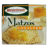
4. from what i figure there are 2 routes to reach all Jews. One is tradition which can be found with such major Jewish food companies as Manischewitz
specializing in traditional items like matzo, and sacramental wine.
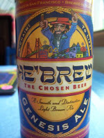
The other route which tends to
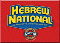
appeal a lot more to me is humor. There are companies like Schmaltz brewing company who's signature item is "He-brew : The Chosen Beer" and there is the more widely known
"Hebrew National : We answer to a higher authority."
5. Well, honestly, I could not find anything saying that they don't vote. But I think that this could be geared towards Jewish Youth which in most cases is far far more reformed than their parents. I think raising voting awareness for those who just reached the voting age could be a worth while demographic.
Some resources -
The Jewish Virtual Library - Shows the percentage of Jewish votes in every election since 1916
American Jewry Today - National Jewish Population Survey
Thursday, September 18, 2008


Friday, September 12, 2008

Thursday, September 11, 2008
Sunday, September 7, 2008
Thursday, September 4, 2008
pez stuff.


I did my best to get as many as I could. I would have continued... but I thought even this is pushing it.
Wednesday, September 3, 2008


Tuesday, September 2, 2008

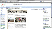
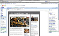
Well with this first attempt I really kind of got stuck on the really cut and dry look. I had a hard time getting away from the olde look of the New York Times logo. I chose really muted colors and just did a main article with related articles.
For my second attempt I tried to push and clean up my type. Stuck with the boring more practical ideas. Not pushing colors or layout. This one I think doesn't work because I made the related items almost the same size as the main article.
My third attempt made use of a slightly more design oriented layout. A dark grey background with a low opacity NYTimes logo, under a new sand serif logo, I felt it looked a little like a cityscape. I combined all links and media into one column right under the main image of the featured article.

I made a final attempt to young it up a bit. its still clean but it has a little more to it. I used the original logo as a back ground texture, and made an icon system. I used 3 icons to represent the things the subscriber would have checked off as interests when signing up. They are color coded, and each section would correspond to whatever subject it lies under.
Yuppie Research
In my research, I found a little more of what I sort of knew. The modern day young urban professionals, or "yuppies" are a little more into hip trends. The are still buisness oriented, but they are more in the fields of art galleries, coffee shops, green building, and farther away from the stockmarket.
This is the most helpful article I found on the subject.
After that article I found more information in articles about what their interests. Finding any other info on yuppies was pretty useless.
Subscribe to:
Posts (Atom)